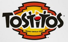
 Tostitos
If you look at the center of this logo, you can see two people enjoying a Tostito chip with a bowl of salsa. This logo conveys an idea of people connecting with each other.
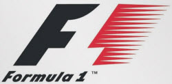
Formula 1
At first, this logo might not make much sense. But if you look closely, you’ll see the number 1 in the negative space between the F and the red stripes. I also love how this logo communicates a feeling of speed.
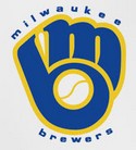
 Milwaukee Brewers
The Milwaukee Brewers is a professional baseball team from Milwaukee, Wisconsin (well, duh…). Their logo is actually made up of the letters M (on top) and B (below the m). These two letters also form a baseball glove.
Northwest Airlines
This simple looking logo actually carries a whole lot of information. First of all you can see the letters N and W, the first two letters of the brand name. But what most people don’t see is the compass that points to the Northwest, another reference to the brand name.
 FedEx
FedEx
This is probably one of the best known logos with a hidden meaning. If you look closely, you’ll see an arrow that’s formed by the letters E and x. This arrow symbolizes speed and precision, two major selling points of this company.
 Amazon.com
This logo doesn’t seem to hide much at first sight, but it gives you a little insight in the philosophy behind the brand. First of all, the yellow swoosh looks like a smile: Amazon.com want to have the best customer satisfaction. The swoosh also connects the letters a and z, meaning that this store has everything from a to z.

“hidden”?
Not hidden messages but very creative logo design.
By hidden, I think they mean that you might not be aware of the meaning of parts of the logo.
yay brewers! unfortunatly that’s not the current logo for them anymore, but you can still by “retro” wear with it.
In the Northwest logo, I’ve always seen the N and the compass point, but never noticed the W. Now that I know it’s there, I still have to make a conscience effort to see it.
DJ,
conscience or conscious? Just wondering…..;-)
Dayum. Ya got me Paul. You’re right.
What’s funny about Northwest is when the geniuses kept the symbol the same on both sides of the tail of the plane–so on one side, the arrow points to the northwest, but on the other side, it points to the northeast.
Wasn’t Jonco clever when he gave this site its name? See the S&P right in the middle? Like salt and pepper, Bits & Pieces adds flavor to our otherwise bland day.
Ok now who’s going to make a new banner with salt and pepper shakers where the S and P are?