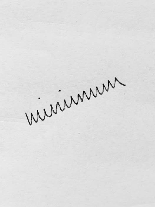
It doesn’t look right because it isn’t right; that’s not even close to how you make a cursive m and the n isn’t correct either.

It doesn’t look right because it isn’t right; that’s not even close to how you make a cursive m and the n isn’t correct either.
Looks like my last EKG.